
 |
| Snow blankets my garden as my sage sleeps |
My favorite groundhog, Paxatawny Phil, said on Monday that we are getting six more weeks of winter. Right now we are just recovering from a pretty decent storm that lasted three days. We haven't shoveled yet...that will happen after I finish writing this.
Right now everything is white except for these two plants by my garden path. It is very calming and quiet. Have you ever noticed how quiet it is after a snowstorm before everyone starts up their blowers and begins digging out?
I have a book called Frederick, by Leo Lionni, which I have talked about before. He is a little field mouse who gathers things that we take for granted like colors and things to say.
I also gather colors for days like today. I have a house full of color and variety so today I will be like Frederick and fill this blog with different tinges.
This palette is based on the yarn colors that were available in my house. You will find that when you buy yarn you will not always be able to get exact colors and that is fine. You will also find that sometimes color rules and recommendations may not be what you envision, always use what colors bring you joy. The way your head, eyes, and heart balance colors relates to your personal sense of beauty.
There is no wrong way to combine color in knitting;
if you like it, do it.
Even if it breaks the rules;
in the end, it is only your opinion that matters.
These are just some guidelines that you can use if you choose.
A good color contrast means that eye strain is reduced because your attention can focus. When there are too many high-contrast colors your eye bounces around without a place to rest your fabric appears chaotic and gaudy. When there are too many low-contrast colors your eye starts to meld everything together and it appears drab and dull.
 |
| In this example, the main color green yarn I used was also in the colorway I used and the design was sadly lost. |
 |
| In this example, both yarns are full of high bright values, and the design is lost. |
Sometimes using too much of the same color family can lead to muddy or dull combinations. Changing one color can sometimes make all the difference.
But then there are gradients that gradually shift color and even though they are in the same color family they can be very soothing as the gentle changes are pleasant to follow...more on that later.
My yarns are Knit Picks palette. Can you believe I only had only this one mostly true blue out of like, 200 skeins?

Primary Colors: red, blue, and yellow
These colors cannot be made by combining other colors.
All other colors come from mixing them together in different combinations.
I have enclosed a black and white photo of the yarns because I find this very useful in seeing if the colors that I am using are in the same chromatic value or how light or dark a color is.

This is something that you can do before purchasing your yarns so you don't have to find out when you get home. If you are buying them online then you can take the sample photos and save them into a collage and then use a black and white filer on them.

Secondary Colors: purple, orange, and green
These colors are made by combining two primary colors.
red and yellow = orange
blue and yellow = green
red and blue = purple

You might want to swap it out unless you are in love with that color. Maybe knit a swatch with it and see what you think when the colors have time to play together and meld.
For this tutorial, I am going to try some other combinations.


These six colors relate to each other based on where they are on the color wheel spectrum.
Warm colors are red, yellow, and orange
Warm colors evoke fall leaves, sunrise or sunset, passion, energetic and positive feelings.
 |
| This was the first sweater that I ever made. It is full of warm color tones and makes me think of fall and pumpkin pie. |
Cool colors are blue, green, and purples
Cool colors evoke subdued, night, water, nature, calming and relaxed feelings.
 |
| This was a prayer shawl that I made for Mom in cool color tones. I thought it was very serene. |
Complementary Colors: Another way to combine colors is to choose a complementary match. These colors are sharply in contrast to each other and they are very pleasing to the eye.
Complementary colors are across from each other on the color wheel:
green / red
blue / orange
purple / yellow
The other combinations really need the full wheel so let us talk about neutrals and color modifiers.
If you mix two complementary colors of dye in equal amounts you get a neutral color that is the same regardless of which of the two colors you have chosen. It will create a transition from color to color that allows for the eye to pleasingly follow from one color to another.
If you think of sheep colors: brown, black, white, and grey are natural sheep colors. These colors while not like the dyed example of a true neutral are also most often called neutrals sometimes they also include beige and khaki depending on who you talk to.
Brown is made by mixing all three primary dye colors together. Changing the proportions of each primary color can change the hue of the brown. If we think of spices for a moment: more yellow will bring out tones of saffron and more red will bring out tones of chili. You can use secondary colors as well: adding orange can bring out the color of cinnamon.
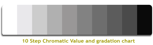
If we look at our value scale above we find black, many shades of grey, and white. These tones of light and dark can help to create contrast and let the eyes rest between colors.
 |
| I absolutely love the use of black to really make the purple pop in this hat. |
 |
| This is one of my favorite yarns that was made for me by an awesome dyer. The accents of white and grey really make the different shades of blue stand out. |
If you have two colors that you love and they are both on the light scale, then you could add a dark grey or black yarn to really let your other colors shine.
Conversely, if all your colors are on a darker scale you could add some light grey or white to let those colors dazzle.
 |
| This set of greens was the closest I could come. I know that the bottom left one looks like it is blue, but in reality, it is spruce. |
Hue and color are used interchangeably but in reality, the hue is the pure true saturation of each of the 12 color families on the color wheel. The top right green is as true green as I have in palette. Saturation is also an indicator of how pure, bold, and rich a color is.
The top left green has been lightened with white (never grey) and is called the tint. Pastel colors are usually tints. While the color has been lightened it is not brighter.
The bottom right green has been lightened with grey a mixture of white and black and is called the tone. If too much grey is added it can make a color dull and lifeless. Most toned colors though are very calming to the eye.
And finally, the spruce on the bottom left is darkened with black to create the shade. Shades contain no white or grey.
 |
| I'm sorry this is a terrible photo but it was the only chroma that I had in my collection. Whereas this pink is not a true hue, you can see how adding black, white, or grey can gradually change the gradient. |
If you take a color from hue to shade you get the chroma. The colors in the chroma can be found in gradient yarns and they are very pleasing to the eye.
This was just a bit of getting our feet wet with color. When you add the third or tertiary colors then it really gets fun!
If you have any favorite color combinations I'd love to hear them in the comments! My all-time favorite trio is green, red, and purple...I just adore those colors together!
****************************
If you have any questions or comments on this or any of my other tutorials, please leave me a comment.
****************************
Safe socially-distanced hugs 🤗
****************************
Sending love and light to everyone being affected by this virus.
May you be safe.
May your loved ones be safe.
🙏
***************************
Sending love and light to everyone facing discrimination, hate, prejudice, inequality, or racism.
🙏🙏💖💖🙏🙏
No comments:
Post a Comment