Friday, February 19, 2021

A Day of Slipping

This week we got a bunch of ice and things are quite dangerous around here today.  We needed to clean up stuff enough for our local farm delivery tomorrow and it was super slippery out there.  

Right now it is still sleeting or as my phone's weather app calls it, ice pellets.  Ice pellets sting a bit after being pelted with them for a while.

After my son and I tackled the driveway, I am back inside.

We have been talking with a gaming friend in Texas who only gets 45 minutes of power every hour and a half.  

Our prayers go out to all the people without power and or water across the globe.  πŸ™ 

Did you know it is snowing in Athens, Greece?

*************

So what do you do on an icy day...knit of course.  lol

I was thinking about what I would write about this week as I was shoveling.  The ice if nothing else, is very soothing as it falls.  But I had to be very careful not to slip.

And then it came to me...slipping.

Slipping is something that we do all the time in knitting and it is totally safer than ice.  πŸ˜€

Stitches can be slipped knitwise or purlwise with different results.

Usually, a pattern will denote which way to slip but if it doesn't you can usually sus out which way to slip.

Terminology

WYIF / WYIB

It is important to note that the working yarn placement is also very important to how a slip stitch is worked.

The yarn will either be WYIF - with the working yarn in the front or WYIB - with the working yarn in the back 

Some patterns carry the yarn across the front when slipping to create a different sort of motif.

Gulls and Garter

As you can see from the Gulls and Garter stitch pattern that the yarn has been carried across the front of the work to create this interesting motif.

Purlwise

Stitches slipped purlwise or tip-to-tip do not change at all.  The front leg is still on the right-hand side of the stitch as normal stitch mounting dictates.

This is usually what is meant by sl 1.

To slip purlwise you insert the right-hand needle into the stitch on the left-hand needle as if to purl.  Your working yarn can be in the front or the back of your work as the pattern dictates.  The stitch is moved to the right-hand needle without working it.

Purlwise slipping is usually used in stitch patterns that will be worked in the next row.

Knitwise

Stitches slipped knitwise are changed.  The front leg is now on the left-hand side of the stitch and the stitch is twisted.

Knitwise slipping is used in some stitch decreases such as the SSK (slip, slip, knit) or the SKP (slip, knit, pass the slipped stitch over [PSSO]).  

These two examples are left-slanting decreases.

To slip knitwise you insert the right-hand needle into the stitch on the left-hand needle as if to knit.  Your working yarn is in the back for the above-mentioned examples.  The stitch is moved to the right-hand needle without working it.

Knitwise slipping is usually used in stitch patterns that will be worked on the same row that they are slipped on.

CDD / CDDP
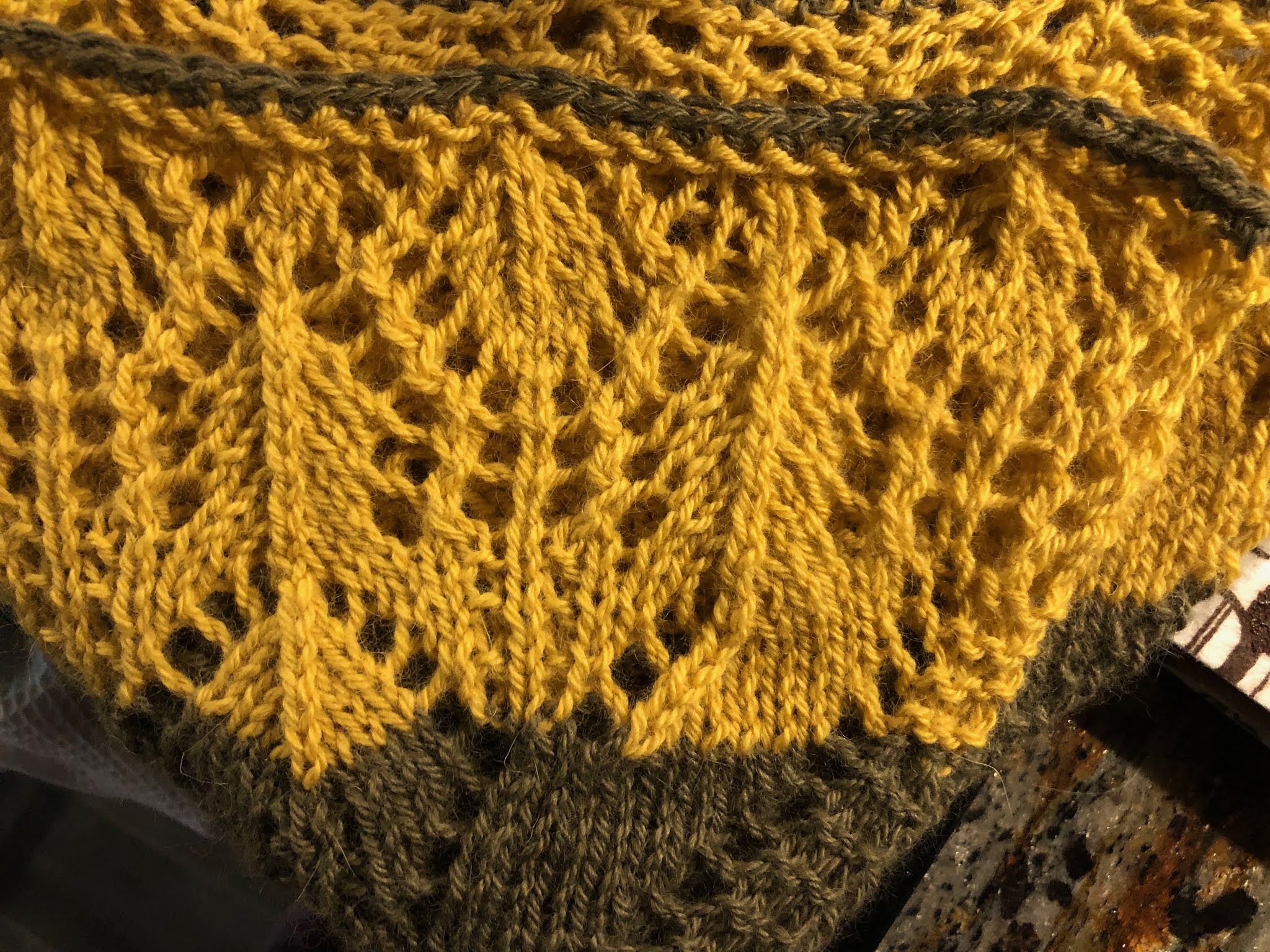
the vertical lines going through the lace
are using the CDD decrease


In the case of a CDD or central double decrease, two stitches are slipped knitwise at the same time WYIB.  This decrease as well as its sister decrease, the CDDP, does not slant in either direction and is vertically centered through the three stitches.

These stitches also go by S2KP2 and *SSPP2

* Note the Craft Yarn Council has a different version of how to do this stitch than I use, but recently when I submitted a pattern it seemed that this stitch had been revised to be more of an S2PP2, though this is my abbreviation for the process and is not used anywhere else.  It seems that CDD and CDDP are considered the "terminology" used for these two stitches more often than not.

My two cents: from swatching the two versions SSPP2 and S2PP2 seem to pretty much end up with the same result.

CDD - sl2 stitches together knitwise, K1, pass the 2 slipped stitches over


In a CDDP or central double decrease purl, two stitches are slipped through the back loops purlwise at the same time WYIF.


TBL


To knit through the back loop (tbl) you insert the right-hand needle through the back of a stitch on the left-hand needle from right to left.


A purlwise version (p tbl) is achieved by inserting the right-hand needle through the back of the stitch on the left-hand needle from left to right. It is a bit tricky at first to get the hang of IMHO.


CDDP - sl 2 stitches together purlwise tbl, P1, pass the 2 slipped stitches over

Some Slip Stitch Patterns

Linen Stitch

linen stitch

Linen stitch uses slipped stitches to make a woven pattern.  The stitches in linen stitch are slipped purlwise with the yarn in different positions.  The wraps create the woven type fabric.

The pattern for one color linen stitch is as follows (I included a slip stitch edge in the pattern):

Row 1: sl 1 WYIB, K1, *sl 1 WYIF, K1* repeat ** until the end

Row 2: sl 1 WYIF,  P1, *sl 1 WYIB, P1* repeat ** until the end

Brioche

here is an example of one and two-color brioche

Brioche is a two-sided squishy fabric that uses slipped stitches, yarn overs, and a bunch of other specially named stitches.  You can read about brioche in this past post.

Mosaic Knitting


this sweater uses slipped stitches to create a motif of cats

Mosaic knitting is knitting with two or more colors to create a motif.  Mosaic knitting often uses high contrast colors to make the design really shine. 


Mosaic knitting provides a nice foray into colorwork as you only knit with one color at a time while slipping the other color.  Each color is used for two rows.


All rows are slipped purlwise.  The knit rows are slipped WYIB, the purl rows are slipped WYIF. The purl row will mirror the knit row in yarn color placement.


Most mosaic patterns are worked from charts.  

Slip Stitch Edging

A slip stitch edge can really change the way your finished item looks and it is super simple.

Here are two ways to work a slip stitch edge:

Slipping Every Row

In this method, you slip the first stitch of every row purlwise but the working yarn is either held in the front or the back depending on the fabric you are creating.

If you are using a knit garter stitch edge where every stitch is knit, you would sl 1, WYIF.

If you are using a purl garter stitch edge where every stitch is purled, you would sl 1 WYIB.

If you have a stockinette stitch edge where the first row is knit and the second is purled, you would work the knit side, sl 1 WYIB, and then the purl side sl 1, WYIF.

If you have a reverse stockinette stitch edge where the first row is purled and the second is knit, you would work the purl side, sl 1 WYIF, and then the knit side sl 1 WYIB. 

I like this method because it is easy to remember to slip each row.  It does sometimes get confusing remembering where the working yarn is since it changes row to row.

Slipping Two Stitches Every Other Row

In this method, you slip the first and last stitch of every row purlwise but the working yarn can be held in the front or the back depending on the fabric you are creating.  On the second row, you will not slip any stitches.

If you are using a knit garter stitch edge where every stitch is knit, you would slip the first and last stitches WYIF.

If you are using a purl garter stitch edge where every stitch is purled, you would slip the first and last stitches WYIB.

If you have a stockinette stitch edge where the first row is knit and the second is purled then you would slip the first and last stitches WYIB.

If you have a reverse stockinette stitch edge where the first row is purled and the second is knit then you would slip the first and last stitches WYIF.

I like this method because you have one side that you are slipping on and you can mark it with a locking stitch marker or piece of string to act as a reminder.  Also, the working yarn will be in the same position so it is easy to keep track of.

What Happens When the Slipping Slips Up? (say that 10 times fast)

Mistakes happen to everyone.  The first thing I always tell students is to breathe, then put their work down, and finally make a plan for recovery.

That horizontal bar three stitches down is a mistake

You could be blissfully knitting away and when you get to your edge it looks like this.  Somewhere you should have slipped and didn't or slipped in the wrong direction but that is okay.

The thing about this edge is that it is mostly separate from your work and is easy to fix.

So let's make a recovery plan.

You want to start by removing the last stitch off of the needle.  Let it drop and take out the working yarn, it is not going anywhere.

the three unraveled edging slip stitches

Now your slipped stitches are free to work with.  Unravel each carefully even though they are not going anywhere.

Each stitch is inside the last.  Pull out each stitch until you have undone the mis-slipped stitch.

Then re-ladder then up with a crochet hook.  If you never have done that - here - is a post on re-laddering.

Put the resulting loop on your left-hand needle and rework it.

Ta-da!  

Happy Slipping!

****************************

If you have any questions or comments on this or any of my other tutorials, please leave me a comment.

****************************

Safe socially-distanced hugs  πŸ€—


****************************
Sending love and light to everyone being affected by this virus.  

May you be safe.  

May your loved ones be safe.  

πŸ™

***************************

Sending love and light to everyone facing discrimination, hate, prejudice, inequality, or racism.
πŸ™πŸ™πŸ’–πŸ’–πŸ™πŸ™


Wednesday, February 10, 2021

More Snow, More Colors

another snowy day


That famous little furry groundhog of ours saw his shadow this year at Gobbler’s Knob and that means six more weeks of winter for our region.


I’ve been thinking about what would happen if someone dragged me out of my nice warm bed only to face my shadow on a cold and snowy day and it is a frightening thought.


Not because our shadow selves are evil or mean but self-work at 5 AM only happens after coffee.


Our shadow self, according to Psychology, is the pieces parts of ourselves that we choose to forget, ignore or abandon altogether.


These shadows are shaped by our perceptions and what we have chosen (even if it is unconsciously) as the parts of us that don’t mesh with everything else.


They are not negative pieces of us.  These shadows are just things that we have kept deep down.  They could be things that we are super proud of but are afraid to share because of the chance of ridicule.  They could be the fact that we always do things last minute which ends up in things being done less than standard.  They could just be a simple fear magnified that led us to make different life choices to avoid facing that fear.


In truth, they could be anything.  Every person’s shadow is as individual as they are.  They are a necessary part of us that provides balance to the light in us.  Even people who are purely happy have a shadow self.


This shadow self cannot be banished, healed, or waved away, it is a part of us.  What is called for here is understanding, compassion, and holding space for our shadow self.


There is deep insight that we can gain about our inner workings from working with our shadow selves but it takes a bit of work as does any good relationship.  In the end, I think all self-work is worth it if it helps me function a little better.


One of my shadow self traits is an overwhelming irrational fear response to something as simple as making a phone call.  


If my shadow self has deemed that I have waited too long to contact a friend then it becomes this source of anxiety to me that first, I have been a horrible friend since I didn’t reach out, second that this person must be upset with me now and three I ruined a beautiful friendship.


When I finally face my fear and do make the connection with my friend they are like, “well, I could have reached out too you know?”  


Well, no, that never occurred to me in all the scenarios that go through my brain that I wasn’t alone in this situation.


This is one of my biggest shadow self challenges is understanding irrational fear responses to simple things like opening a box I ordered, going back to a pattern I messed up, or simply making a call that I want to make.


My head makes up so many reasons why I should not do these things that I actually lose the reality of the situation.


It is very hard to sludge through the mire to find the kernel of truth for this response being blown out of proportion.


I find talking to friends about these fears or journaling about them brings up insights that help my perception to shift a little bit or allow me to see that I am not alone in some of these fear cycles.


And that is the biggest thing that starts to transform a fear for me is acknowledging that I am not the only one who feels this way.  There are other people who face these challenges and connecting with them has helped me to feel like part of a fear collective group than facing all these challenges alone.


When these feelings arise I try and write them down in my journal and then I work out with some inner dialogue why there is fear in this situation and what is the central core of this fear.


If I’ve talked about this before, forgive me but it is my best example of this process.


I became afraid of the mice in the basement.  It became so bad I was afraid to even step foot in there.

The fear was doing its job, keeping me safe.  The virus that mice can carry is real.  It is usually a fatal virus and it is horrible.  

My early fear cycle response made this an easy path for me to follow without even realizing it.  Just avoid the fear, and thus I am safe.  Simple.

But then I tried bringing in light and listening to the fear because as I stated the fear itself is based in reality and the fear was just trying to protect me.

Without judgment, I tried to understand and then incorporate a way that both I and the fear would be happy.

We agreed that I would wear a mask, use gloves, and clean everything with a virus-killing agent.

Once this agreement was made the fear was still with me for a while, I think it was waiting to see if I would uphold my end of the bargain, which I did.

All the while, I thanked the fear for allowing me to do this cleaning that not only uplifted me but the entire household.  It also allowed me to rid the house of the thing that the fear was well…afraid of.

As time went by the fear realized that we were true partners and it was as if a veil lifted and I felt lighter when I would go in the Basement.  The fear was gone.  Together the fear and I were co-creating a different path.

It all started with listening.

Some revelations take longer than others but with time, compassion, and understanding the answers will come.

*************************************************
Last week we touched on the first six colors of the spectrum that makes up the twelve pure color families.  Today we will continue that discussion.


Here is my palette sampler of colors that were closest to the pure hues of the spectrum.

It really looks more like this:

(my yarn example above is flipped from the chart but cats prevented me from redoing it)

Here we can see that our six colors once again created new colors, the name of these colors changes based on preference.  The primary color is always listed first and then the secondary.  A primary and secondary color creates a tertiary color. 

red / purple = red-purple or magenta
blue / purple = blue-purple or violet
blue / green = blue-green or teal
yellow / green = yellow-green or chartreuse
yellow / orange = yellow-orange or amber
red / orange = red-orange or vermillion

These new additions open up a whole new world of possibilities.

When looking at complementary colors we can now choose things like magenta and chartreuse or teal and vermillion for example.

Also, our warm and cool colors have now expanded.  Magenta, amber, and vermillion are warm colors, and violet, teal, and chartreuse are cool colors.

This expansion of the colors also allows us to create new combinations.

Analogous colors are three colors side by side; they are inherently harmonious with each other.  They dominate, support and accent each other at the same time.  They are soothing and calming to the eye.

An example would be: chartreuse, green, and teal

Split complementary colors are when you go across the wheel to the complementary color and then you move one wedge over.  You can choose either of the two wedges that surround the complementary color.  These combinations add brightness and vibrancy that allows the eye to relax.  

An example of this would be:  starting with yellow, its complementary color is purple.  You can choose, violet or magenta as a compliment. 

Triadic color combinations skip every three colors from your starting color to create an equilateral triangle.  These combinations have a balanced contrast and are harmoniously balanced at the same time.

An example of this would be:  starting with red, skip 3 to yellow, skip 3 to violet

Tetradic or rectangle combinations use four colors arranged into two complementary pairs. The tetradic color scheme works best if you let one color be dominant.  You should also pay attention to the balance between warm and cool colors in your design.

An example of this would be:  vermillion and teal + amber and violet


Quartet combinations skip every two colors from your starting color to create a square.  These groupings provide balance in contrast between warm and cool colors.  In most cases, the colors will not be used in the same proportions to create a harmonious color scheme.


An example of this would be: starting with blue, skip 2 to vermillion, skip 2 to orange, skip 2 to 

chartreuse


For any of these combinations, you can choose any color on the chroma spectrum of that wedge that includes its hue, shade, tint, and tone.


Here are some other examples:


In this sample, you can see the use of tints to create
a spring palette that is pleasing to the eye. 
Magenta and chartreuse complement each other as do amber and violet.  

This is a very different take on the same pattern using a shaded palette that is very earthy and comforting to the eye.  Dark blues and greens are accented with earthy neutrals of grey, brown, and tan.

This is a cool color example of green, purples, and blues creating a serene feeling in a fabric.
This colorway invokes nature with either a seascape or a green field surrounded by a beautiful blue sky.
This hat uses green as a background color and then a gradient yarn that changes from deep purple into violet and then white. 
It reminds me of a garden dotted with flowers.

This piece makes me think of fall. 
The orange goes through a chroma transformation
that is accented by the black transforming into white.

These are just some examples of a few of the myriad of different combinations that you can create. 

I can't wait to see the beautiful things you design!

****************************

If you have any questions or comments on this or any of my other tutorials, please leave me a comment.

****************************

Safe socially-distanced hugs  πŸ€—


****************************
Sending love and light to everyone being affected by this virus.  

May you be safe.  

May your loved ones be safe.  

πŸ™

***************************

Sending love and light to everyone facing discrimination, hate, prejudice, inequality, or racism.
πŸ™πŸ™πŸ’–πŸ’–πŸ™πŸ™


Wednesday, February 03, 2021

Playing With Color on a Snow Day


Snow blankets my garden as my sage sleeps

My favorite groundhog, Paxatawny Phil, said on Monday that we are getting six more weeks of winter.  Right now we are just recovering from a pretty decent storm that lasted three days.  We haven't shoveled yet...that will happen after I finish writing this.

Right now everything is white except for these two plants by my garden path.  It is very calming and quiet.  Have you ever noticed how quiet it is after a snowstorm before everyone starts up their blowers and begins digging out?

I have a book called Frederick, by Leo Lionni, which I have talked about before.  He is a little field mouse who gathers things that we take for granted like colors and things to say.

I also gather colors for days like today.  I have a house full of color and variety so today I will be like Frederick and fill this blog with different tinges.

This palette is based on the yarn colors that were available in my house.  You will find that when you buy yarn you will not always be able to get exact colors and that is fine.  You will also find that sometimes color rules and recommendations may not be what you envision, always use what colors bring you joy.  The way your head, eyes, and heart balance colors relates to your personal sense of beauty.

There is no wrong way to combine color in knitting; 

if you like it, do it.

Even if it breaks the rules;

in the end, it is only your opinion that matters.

These are just some guidelines that you can use if you choose.

A good color contrast means that eye strain is reduced because your attention can focus.  When there are too many high-contrast colors your eye bounces around without a place to rest your fabric appears chaotic and gaudy.  When there are too many low-contrast colors your eye starts to meld everything together and it appears drab and dull.  


In this example, the main color green yarn I used was also in the colorway I used and the design was sadly lost.

In this example, both yarns are full of high bright values, and the design is lost.

Sometimes using too much of the same color family can lead to muddy or dull combinations.  Changing one color can sometimes make all the difference.


But then there are gradients that gradually shift color and even though they are in the same color family they can be very soothing as the gentle changes are pleasant to follow...more on that later.


My yarns are Knit Picks palette.  Can you believe I only had only this one mostly true blue out of like, 200 skeins?


Primary Colors: red, blue, and yellow

These colors cannot be made by combining other colors.  

All other colors come from mixing them together in different combinations.

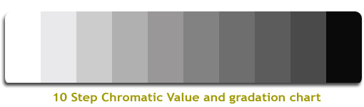
I have enclosed a black and white photo of the yarns because I find this very useful in seeing if the colors that I am using are in the same chromatic value or how light or dark a color is.

Too much of the same value will muddy a fabric and lower the contrast.  

This is something that you can do before purchasing your yarns so you don't have to find out when you get home.  If you are buying them online then you can take the sample photos and save them into a collage and then use a black and white filer on them. 


Secondary Colors: purple, orange, and green

These colors are made by combining two primary colors.  

red and yellow = orange

blue and yellow = green

red and blue = purple

You can see here that the chromatic value of green and purple are very close.  This purple was a heathered yarn and it had a bunch of deep tones in it.

You might want to swap it out unless you are in love with that color.  Maybe knit a swatch with it and see what you think when the colors have time to play together and meld.

For this tutorial, I am going to try some other combinations.


You can see in this photo that I tried two very different purples.  One is really dark and one has much more blue in it and is lighter.
When we look at the chromatic values, they are now each very different from each other.

So, maybe in the case of the heather, I would sub it out for one of these depending on my needs and the design.


We can break the colors down further and I will talk about that in a future post.  Today let us focus on these six colors.


These six colors relate to each other based on where they are on the color wheel spectrum.

There are all kinds of ways that you can combine them based on your need and fabric.

For instance, there are cool and warm colors and they can influence how we feel about different hues.  You will find as you delve into color theory that many colors have emotions that they evoke when they are present.

Warm colors are red, yellow, and orange

Warm colors evoke fall leaves, sunrise or sunset, passion, energetic and positive feelings.

This was the first sweater that I ever made.  It is full of warm color tones and makes me think of fall and pumpkin pie.  

Cool colors are blue, green, and purples

Cool colors evoke subdued, night, water, nature, calming and relaxed feelings.

This was a prayer shawl that I made for Mom in cool color tones.  I thought it was very serene.

Complementary Colors: Another way to combine colors is to choose a complementary match.  These colors are sharply in contrast to each other and they are very pleasing to the eye.

Complementary colors are across from each other on the color wheel:

green / red

blue / orange

purple / yellow

The other combinations really need the full wheel so let us talk about neutrals and color modifiers.

If you mix two complementary colors of dye in equal amounts you get a neutral color that is the same regardless of which of the two colors you have chosen.  It will create a transition from color to color that allows for the eye to pleasingly follow from one color to another.

If you think of sheep colors: brown, black, white, and grey are natural sheep colors.  These colors while not like the dyed example of a true neutral are also most often called neutrals sometimes they also include beige and khaki depending on who you talk to.

Brown is made by mixing all three primary dye colors together.  Changing the proportions of each primary color can change the hue of the brown.  If we think of spices for a moment:  more yellow will bring out tones of saffron and more red will bring out tones of chili.  You can use secondary colors as well:  adding orange can bring out the color of cinnamon.

If we look at our value scale above we find black, many shades of grey, and white.  These tones of light and dark can help to create contrast and let the eyes rest between colors.  

I absolutely love the use of black to really make the purple pop in this hat.

This is one of my favorite yarns that was made for me by an awesome dyer. 
The accents of white and grey really make the different shades of blue stand out.

If you have two colors that you love and they are both on the light scale, then you could add a dark grey or black yarn to really let your other colors shine.  

Conversely, if all your colors are on a darker scale you could add some light grey or white to let those colors dazzle.


This set of greens was the closest I could come. 
I know that the bottom left one looks like it is blue, but in reality, it is spruce.

Hue and color are used interchangeably but in reality, the hue is the pure true saturation of each of the 12 color families on the color wheel.  The top right green is as true green as I have in palette.  Saturation is also an indicator of how pure, bold, and rich a color is.

The top left green has been lightened with white (never grey) and is called the tint.  Pastel colors are usually tints.  While the color has been lightened it is not brighter.

The bottom right green has been lightened with grey a mixture of white and black and is called the tone.  If too much grey is added it can make a color dull and lifeless.  Most toned colors though are very calming to the eye.

And finally, the spruce on the bottom left is darkened with black to create the shade.  Shades contain no white or grey.

I'm sorry this is a terrible photo but it was the only chroma that I had in my collection.
Whereas this pink is not a true hue, you can see how adding black, white, or grey can gradually change the gradient.

If you take a color from hue to shade you get the chroma.  The colors in the chroma can be found in gradient yarns and they are very pleasing to the eye.

This was just a bit of getting our feet wet with color.  When you add the third or tertiary colors then it really gets fun!

If you have any favorite color combinations I'd love to hear them in the comments!  My all-time favorite trio is green, red, and purple...I just adore those colors together!

****************************

If you have any questions or comments on this or any of my other tutorials, please leave me a comment.

****************************

Safe socially-distanced hugs  πŸ€—


****************************
Sending love and light to everyone being affected by this virus.  

May you be safe.  

May your loved ones be safe.  

πŸ™

***************************

Sending love and light to everyone facing discrimination, hate, prejudice, inequality, or racism.
πŸ™πŸ™πŸ’–πŸ’–πŸ™πŸ™


Wednesday, January 13, 2021

Happy New Year!

I hope that all you beautiful people had a lovely holiday celebration full of bright and beautiful blessings!  πŸ’–πŸ€—  I know that this is a bit late but we actually kicked back and relaxed and then it took me a while to finish my project du jour.


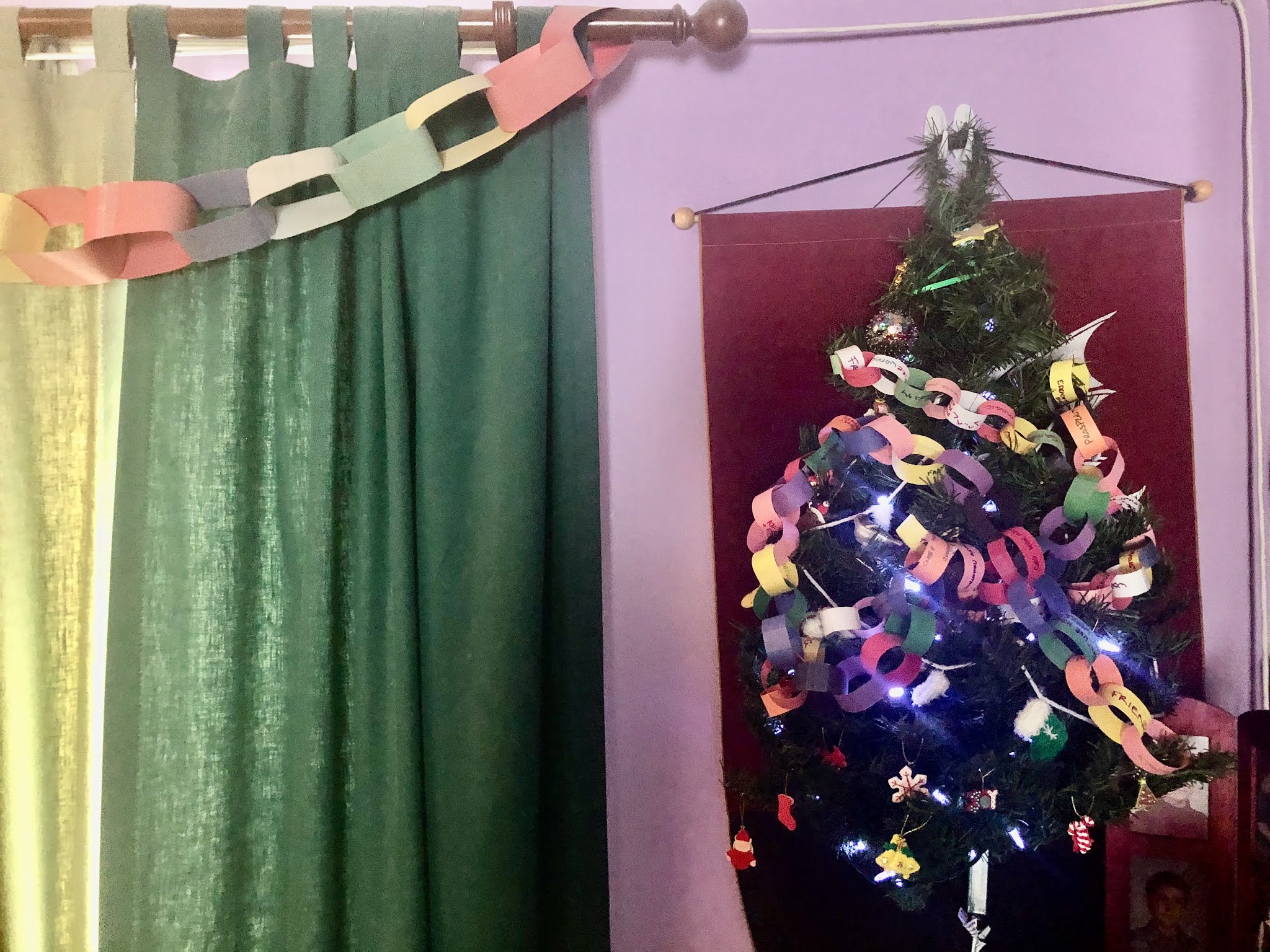
This tree was given to and made for us by the wonderful and creative Nana.  It has been up all year as a reminder of the love and light of family and friends uplifting us during these hard times.

It also is bedecked with the chains that my friend's family and I have been making for the last 20 years.  It is our special holiday ritual to make chains of our blessings and to add them to our tree.  You can see an old one hanging on our curtains.

Whenever I feel a little sad or need a bit of light, I just look at our many colorful chains filled to the brim with blessings.  I need a room just for these beautiful links because we have had so many things to be thankful for over the years and I treasure all of them.

πŸ’–

******

Who is this?


So, I have been finishing up projects and getting them off to the people they were for.  This little guy was on my list so I have been hard at work getting him dressed in time for the big day.

I have made a bunch of Sheldon's before and I love this pattern.  You can find his pattern here.

Here is Sheldon with his shell on sitting on my new Dreamtree journal

 ******
With a new year comes new goals and I usually post some of them here but I think that having a goal doesn't mean that there is this rigid idea to get to it, one has to be open to the different pathways that open up to get there.

My goals are simple really:
  • Be empowering - convert intention into action - I have confidence in myself and my ability to make changes and decisions to create a healthy lifestyle of body/mind/spirit.  This ties directly into valuing myself and expressing my passion.
  • Be passionate - Every day is a gift I try to begin it early and I am thankful for the opportunity to do so.  (Have an attitude of gratitude) Do things that I love doing at least once every day and gain immense happiness from doing them.  Take time to learn everything about a subject and really understand it.  Have monthly dates with DH.  Be me more even if others judge it as whatever.  Be true to my inner nature and love myself fiercely regardless of where I am in my journey.
  • Be organized - Being organized and tidy are not the same (though I am doing that too) - being organized to me means that I know where things are and can find them easily.  It takes a bit of time to set up but once you do, then things just start to flow.  I use three things to organize all those thoughts and ideas and things you want to remember:
    • Workflowy - Workflowy is a bulleted list program that is free for 250 entries a month.  I have been using it forever and lately, it has gotten some love and is even better.  I can enter stuff on my phone and it links with my computer.  So amazingly useful!
    • My Dreamtree journal
    • Pages (I'm a Mac girl)
  • Be prosperous - prosperity is not all about money, it is health, wealth, and happiness and wealth is all my blessings which includes all of you, my family, my friends, my cats, my talents, and too many things to mention.
  • I am worth it - I have struggled with my worth over the years - but my value does not decrease based on someone's inability to see my worth.  I choose to value myself just for being who I am right now, at this moment.
There are a lot of little goals under each of these but this is the focus of my year.  I am going to flow and expand my energy in each of these directions and see where it takes me.  

Focusing on one thing does not take energy from the others.
Be the energy you wish to attract. πŸ’«

I wish you all bright blessings in achieving your goals.  If you break them down into manageable obtainable steps, anything is possible!

****************************

Safe socially-distanced hugs  πŸ€—


****************************
Sending love and light to everyone being affected by this virus.  

May you be safe.  

May your loved ones be safe.  

πŸ™

***************************

Sending love and light to everyone facing discrimination, hate, prejudice, inequality, or racism.
πŸ™πŸ™πŸ’–πŸ’–πŸ™πŸ™